
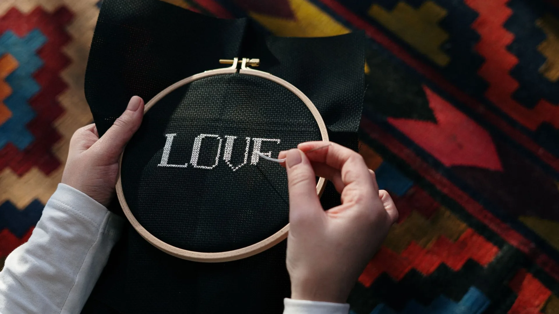
Cross Stitch Alphabets and Lettering: Getting Names to Look Right
Almost every piece that becomes a gift has words on it. A name, a date, a house, a phrase. Lettering is also where a design most often goes wrong, because letters are unforgiving in a way that flowers are not. A slightly lumpy petal reads as a petal. A slightly lumpy letter reads as a mistake.
Filled letters or backstitch letters
The first decision, and it changes everything after it.
Filled cross stitch letters are built from whole stitches, like the rest of the design. They are bold, they read clearly from across a room, and they suit block alphabets and children's samplers. They also take up a lot of space and a lot of stitches.
Backstitch lettering is drawn as lines along the edges of cells rather than filling them. It gives you something much finer, closer to handwriting, and it is what makes script and monogram work possible. It is far quicker to stitch. It is also less forgiving of a wobbly line, and it can disappear against a busy background.
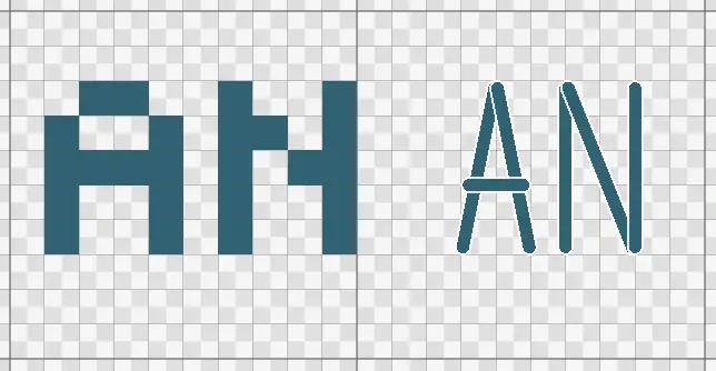
The same two letters both ways. Filled cross stitch on the left, bold and readable across a room. Backstitch on the right, finer and much quicker, which is what suits dates and script.
As a rough guide: block capitals and children's names suit filled letters, while dates, script phrases, monograms and sampler bands suit backstitch. Plenty of designs use both, with a filled name and a backstitched date underneath.
Choosing an alphabet that survives the grid
Computer fonts are designed for smooth curves at any size. A cross stitch grid has neither. An alphabet drawn for stitching handles that deliberately, placing curves on whole cells so they read cleanly at small sizes.
Things to look for:
- A clear distinction between similar characters. Capital I, lowercase l and the digit 1 should not be identical. Same for O and 0.
- Consistent stroke weight. Letters where some strokes are one stitch and others two look accidental unless the alphabet was designed that way throughout.
- A size that suits the piece. Most grid alphabets have a minimum height below which they stop being legible. Seven stitches tall is common for a simple block alphabet, and script needs more.
Avoid rasterising a computer font onto a grid and hoping. It produces uneven stems and half-formed curves, which is exactly the lumpy look you are trying to avoid.
Spacing and centring
This is the practical part that catches people out.
Count the whole word first. Add up the letter widths plus one stitch between letters, then compare that to the space you have. Doing this before you stitch avoids the classic disaster of running out of fabric two letters from the end.
Centre from the middle, not the left. Find the centre of your available space, find the centre of the word, and align those. Working left to right and hoping is how words end up off centre.
Watch the awkward pairs. Some letter combinations look badly spaced at a fixed gap, particularly anything next to A, V, W, T or Y. Closing those by one stitch usually fixes it.
Leave more room between words than between letters. Two or three stitches between words, one between letters, is a reasonable starting point.
Mind the descenders. Lowercase g, j, p, q and y drop below the baseline. Allow for that or they will collide with whatever is underneath.
If you are placing lettering on a larger piece, gridding your fabric first makes centring far easier to get right.
Keeping the text changeable
Here is the thing most worth knowing, especially if you make gifts.
Many tools generate lettering by stamping it onto the chart. From that moment it is ordinary stitches: to change a name you erase it square by square and start again. That is fine once. It is miserable when you want the same design for the next baby, the next wedding or the next house move.
If the text stays an editable object on the pattern, you can change the wording, the alphabet, the size and the position whenever you like. One birth sampler covers every arrival. A wedding design serves the next couple. A date typed wrong is a ten second correction rather than an evening of unpicking.
That is what the text generator is built around, and it is why it lives inside the editor rather than as a separate one-shot tool. There are more ideas for what to put it on in wedding and baby cross stitch keepsakes and cross stitch gift ideas.
Stitching letters neatly
A few habits that make a visible difference:
- Keep your crosses in the same direction. Nowhere shows inconsistency more than a block of letters.
- Use one strand for backstitch lettering on most counts. Two makes fine script look clumsy.
- Do not carry thread far behind letters. Long floats show through the gaps, and letters have a lot of gaps. Finish and restart instead, as in starting and finishing thread.
- Stitch the letters before the background, if there is one. Adjusting a letter is much easier when there is nothing surrounding it.
Try it on something you already have
The quickest way to see the difference is to put a name on a design and then change it. If that takes ten seconds rather than an evening, the tool is doing its job.
You can add text to a pattern in HobbyTub, or browse the pattern library for a design worth personalising.